
The short version
Signups, pageviews, and downloads feel like success and tell you almost nothing. The only question that separates a business from a hobby is whether people come back. Track activation, retention, and revenue, ignore the rest, and never let your dev team convince you the product works because a graph goes up. Growth in the wrong number is worse than no growth, because it hides the truth until it's expensive.
You launched. The signups started coming in. Two hundred the first week, four hundred the next. You screenshotted the graph. You told your investors. For a few days it felt like the thing was finally working.
I want to be the friend who tells you the uncomfortable part before you build a whole story on top of it. Signups are the easiest number in your entire business to move, and one of the least meaningful. A signup costs a person nothing. It says they were curious once. It does not say they got value, it does not say they’ll come back, and it definitely does not say you have a business.
So here’s how to actually tell. Not with more dashboards. With the two or three numbers that mean something, and the honest conversations no dashboard can have for you.
The Numbers That Feel Like Progress
There’s a name for metrics that always go up and never tell you anything: vanity metrics. Total signups. Pageviews. Downloads. Registered users. Followers. They share one property. They can only rise, and no matter what they say, you never change a single decision because of them.
That’s the test. A real metric changes what you do next. A vanity metric just makes you feel a certain way. If a number can go up while your business quietly dies, it’s a vanity metric.
- Total signups (a one-time click that costs the user nothing)
- Pageviews and unique visitors
- App downloads and 'registered users'
- Social followers and email list size
- Any number that only ever goes up
- Activation: how many reach the point where the product is useful
- Retention: how many come back next week, next month
- Engagement: are they doing the core action, not just logging in
- Revenue: are people paying, and are they still paying
- Referral: are users bringing you other users unprompted
None of the left column is useless. Signups are the top of the funnel, and you need a top. The mistake is treating the top of the funnel as if it were the bottom. A thousand signups where nobody comes back is not a smaller version of success. It’s a clear, early signal of failure, dressed up as a win.
I learned this the hard way with my own first startup, TruckTrack. We had raised from real funds, Seedcamp, Passion Capital, and 500 Startups, and I had built a beautiful, auto-scaling system I was genuinely proud of. We also had three and a half paying customers: my mother, her friend, and one more. Another team in our batch had a cheap drone inspecting rooftops, and by demo day they had real customers across San Francisco and part of Manhattan. The funding felt like validation. It was not. The only number that ever validated anything was people who came back and paid.
The Only Question That Actually Matters
If I could give you one question to replace every dashboard you own, it would be this: do people come back?
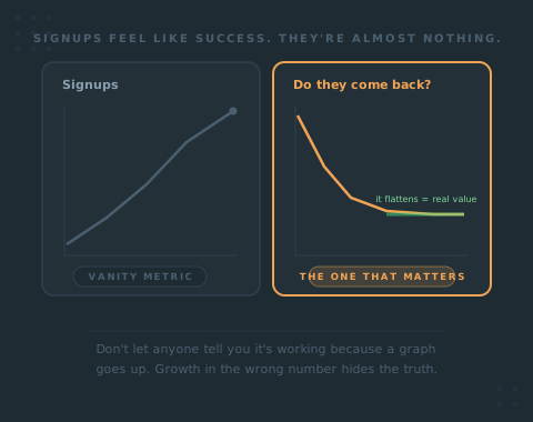
That’s it. Retention is the metric that can’t be faked. You can buy signups with an ad budget. You can manufacture a download spike with a launch push. You cannot fake people choosing, on an ordinary Tuesday with no prompt from you, to open your product again because it solved something for them. Retention is the market telling you the truth about whether you built something worth returning to.
Here’s how to think about it without the jargon. Stop looking at one big pile of users. Instead, group them by when they started. Everyone who signed up in June is one group. Everyone from July is another. Each group is a “cohort”, which is a fancy word for “people who arrived at the same time”. Then you watch each group over time: of the June people, how many are still active in week two, week four, week eight?
A rising total can hide a leaking bucket. You pour more water in each month, the level looks like it’s climbing, and the whole time the bottom is open. Cohorts show you the hole. The headline number is designed to hide it.
When you look this way, one of two stories appears. Either each cohort flattens out at some level and stays, which means a real group of people found real value and kept it, or every cohort decays to near zero within a few weeks, which means you have a slow-motion leak that no amount of new signups will ever outrun. The second story is the most common one, and the total-users graph will never show it to you. That’s exactly why founders keep believing they’re winning right up until the runway ends.
Fifty Metrics Means You Understand None of Them
Once a founder learns metrics matter, the instinct is to measure everything. Forty charts. A dashboard with a number for every action a user could possibly take. It feels rigorous. It’s the opposite.
When you’re watching fifty numbers, you’re watching none of them. There’s no signal, just noise that moves around and lets you pick whichever line is green today to feel good, and whichever is red tomorrow to panic about. This is dashboard theatre: the performance of being data-driven, with none of the decisions.
The discipline is to pick the one metric that best captures whether you are creating real value for a real person, and to make everything else secondary to it. For a marketplace it might be completed transactions. For a content app, weekly active users doing the core thing. For a B2B tool, the number of accounts that hit their “aha” moment in week one. Not five metrics. One, that you’d stake the business on, plus a small supporting cast.
The point of a single focus metric isn’t that other numbers don’t matter. It’s that a team pointed at one clear thing makes better decisions than a team drowning in forty. When someone proposes a feature, you have a real question to ask it: does this move the one number that proves we’re creating value? Most features can’t answer that, and that’s useful to know before you build them.
The Half of the Truth No Dashboard Can Show You
Numbers tell you what is happening. They almost never tell you why. And “why” is where every improvement actually comes from.
Your retention chart can tell you that eighty percent of new users vanish after day one. It cannot tell you that they left because the empty state was confusing, or the value wasn’t clear in the first thirty seconds, or the one feature they came for was buried three clicks deep. To learn that, you have to do the thing founders avoid because it doesn’t scale and it’s uncomfortable: talk to actual users. On a call. Watching them use it. Asking why they stopped.
Ten real conversations will teach you more than ten thousand rows of analytics, because a person can explain the reason behind the behaviour, and a chart never can. The founders who win treat qualitative and quantitative as two halves of the same job. The numbers tell you where to look. The conversations tell you what you’re looking at.
What to actually watch, and what to stop screenshotting.
Do Not Let the Graph Lie to You
Here’s the warning that costs founders the most. At some point, your dev team or your agency will show you a chart going up and to the right and tell you the product is working. Sometimes they’re right. Often they’ve simply found the one number that climbs and pointed at it, because a rising line is the easiest thing in the world to produce and the easiest thing to celebrate. It is not your builder’s job to decide the product is working, and it should never be a graph that convinces you. Growth in the wrong number is worse than no growth, because no growth at least tells you the truth. Growth in the wrong number hides it, buys everyone false confidence, and lets the reckoning arrive later and larger.
Red flag
When 'the numbers look great' should worry you
Someone shows you total signups climbing but can’t tell you week-four retention. The engagement graph is up, but it counts logins, not the core action that creates value. Every review meeting features a different green chart, never the same one twice. Nobody can tell you what decision any number would change. When you ask “are these people coming back?” the answer is a new slide instead of a yes. A dashboard that only ever brings good news isn’t measuring your business. It’s managing your mood.
So make it your job. You don’t need to be technical to ask three questions that cut straight through the theatre: Which number is this, exactly? Do the people in it come back? And what would we do differently if it went the other way? If those questions get a straight answer, you’re in good hands. If they get a reassuring wave and another chart, that’s the signal, not the chart.
A Short List: What to Instrument, What to Ignore
You don’t need a data team to get this right. You need to instrument a handful of things from day one and refuse to be distracted by the rest.
Instrument these: activation (the moment a new user first gets value, and what fraction of signups reach it), retention by cohort (are last month’s users still here this month), the single core action that means your product did its job, and revenue if you charge. Set up basic product analytics before launch, not after, because you can’t recover data you never collected.
Here is how much a single number can move once you are actually watching it. On one product we built a careful registration flow for security: enter your email, get a code, enter it, enter your phone, get another code, enter that, fill in your profile, then finally you are in. Almost nobody reached the end. The conversion was dire. We switched to a passwordless login, enter your email, click a link, you are in, and the number changed completely. Same product, same features, one different path through the door. If we had not been watching where people dropped off, we would never have known the door was the problem.
Ignore, or at least demote, these: raw signup totals, pageviews, downloads, follower counts, and any lifetime “total” that can only ever climb. Glance at them, never steer by them.
The question isn’t whether your numbers are going up. Almost any number can be made to go up. The question is whether the right number is going up, and whether the people behind it keep coming back. Answer that honestly and you know if you have a business. Avoid it, and the graph will keep you comfortable right up to the end.
Working isn’t a feeling, and it isn’t a screenshot. It’s a specific, checkable claim: real people reach value, and enough of them come back that the thing compounds instead of leaks. Everything in this guide is just different ways of asking that one question and refusing to accept a prettier one in its place.
Run the checklist below as an honest gut-check. If it turns up more gaps than you’re comfortable with, that’s usually the moment an outside read pays for itself, and it’s the exact conversation we have most weeks.
Do you actually know if it's working?
Mark what's true for your product right now.
You're steering by vanity metrics. The good news is the real signal is cheap to start collecting today.
Get future guides direct to your inbox